21 December 2012
LOOK: Best Photos of the Year (various sites)
Reuters' 30 best photos of the year. CLICK HERE.
Big Picture Best of the Year, Pt. 1. CLICK HERE.
Big Picture Best of the Year, Pt. 2. CLICK HERE.
Big Picture Best of the Year, Pt. 3. CLICK HERE.
ABC Photos of the Year. CLICK HERE.
International Garden Photography 2012. CLICK HERE.
Astronomy Photographers of the Year. CLICK HERE.
Military Photography of the Year. CLICK HERE.
GDT European Wildlife Photographer of the Year 2012. CLICK HERE.
Landscape Photography of the Year. CLICK HERE.
Sports Photos of the Year. CLICK HERE.
Best Satellite Images 2012. CLICK HERE.
Travel Photography of the Year. CLICK HERE.
50 Best Animal Photos of the Year. CLICK HERE.
Most Powerful Images of 2012. CLICK HERE.
Best Surfing Photo of the Year. CLICK HERE.
Urban Photography of the Year. CLICK HERE.
Wildlife Photography of the Year. CLICK HERE.
Sports Photo Highlights. CLICK HERE.
Time's Top 10 Photos of the Year. CLICK HERE.
Time's Best Portraits of the Year. CLICK HERE.
National Geographic Photo Contest 2012. CLICK HERE.
WSJ Photos of the Year. CLICK HERE.
Agence France-Presse's Best Photos of the Year. CLICK HERE.
The Mail's Best. CLICK HERE.
Huff Po Amazing Photos From Around the World. CLICK HERE.
The Atlantic's Year In Picture. CLICK HERE.
Associated Press' Best Photos of the Year. CLICK HERE.
CNN's The Year In Pictures. CLICK HERE.
2012 London Olympics photos. CLICK HERE.
Toronto Sun's Sports Images of the Year. CLICK HERE.
CNN's 75 Amazing Sports Photos of the Year. CLICK HERE.
ITV's Best Football Photos of the Year. CLICK HERE.
19 December 2012
PROJECT 18: Light, Shadow, & Light Writing
DUE: Bring your 36+ photographs to class on the first class period in January 2013. (25 points)
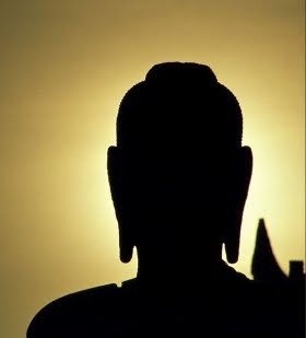
Quite simply, photography could be described as the recording of light as it reflects off of surfaces. This project is designed to force the photographer to seek-out (or fabricate) different kinds of light sources for their subject matter. Light is the backbone in every photograph. In this post-processing, Photoshop-faking, high-dynamic-ranging world of modern photography, beginning photographers often forget about light in the process. It’s to their detriment: Almost every other photographic flaw - poor composition, cheap equipment, etc. - can be excused simply if the light is good. And, despite what a lot of people may think, good lighting is something that just can’t be faked.
DIRECTIONS:
Photographing TWO different 'qualities' of light is the goal. Make 36+ photographs. The different types of light do not have to be grouped together, but keep track of what you have photographed as you will be expected to have the following:
PHOTOGRAPH THE FOLLOWING:
DIRECT SIDE/ABOVE/BELOW LIGHT -- 18 photographsBACKLIGHT (SILHOUETTE) -- 18 photographs
FOUR KINDS OF LIGHT...TWO(!) TO PHOTOGRAPH:
1. DIRECT SIDE LIGHT
Direct light creates distinct, hard-edged shadows.
 |
| Sarah McDowell, Photo 1, Fall 2010 |
What is it good for: Sidelighting is arguably the most aesthetically-interesting of all forms of light. It’s the easiest method to give your images the illusion of depth, as shadows will be darker in a sidelit image. Portraits in front of a window are a classic example of a sidelit look that many photographers try and replicate.
Challenges: Balancing both shadow and highlight areas can be a challenge for many photographers and many digital cameras. This is the most advanced type of lighting, and the setup time and knowledge level necessary for a good exposure is almost certainly increased.
Direct Light – Lighting in which the light goes straight from the source to the lit object. An example is a light bulb or the sun.
Compare that to indirect lighting, which is when there is no single direct light source. The object is lit by scattered or bounce light. For example on a cloudy day when the sun is covered by clouds, its rays are scattered and everything is lit indirectly.
All forms, when lit with direct light have the same elements – highlight, halftone, core shadow, reflected light, and cast shadow. It’s an essential skill to be able to quickly identify each element on a given object and to execute each accurately.
A. Highlight
B. Halftone
C. Core Shadow
D. Reflected Light
E. Cast Shadow
2. BACKLIGHT (SILHOUETTE)
A silhouette is created when the subject matter is between the camera and the light source (the camera is pointing at/into the light source). This produces a black figure of your subject matter, but very little detail in the subject matter.
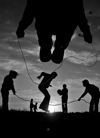 What is it: A subject directly in front of the primary light source.
What is it good for: Backlighting is used to produce sharp silhouettes or interesting lighting effects with partially-transparent objects like flowers or leaves.
Challenges: Most cameras struggle to find the right exposure for a backlit image, making this an effect that’s often easier to produce with manual settings. Poorly-exposed backlit images represent the worst of both worlds, with unclear detail in both the background and subject. The effect also tends to be overused, so images run the risk of being cliche.
3. DIFFUSED LIGHT **YOU ARE NOT PHOTOGRAPHING THIS KIND OF LIGHT**
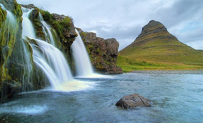
DIFFUSED light is light that hits subject matter AFTER having bounced off a suface or been filtered by something prior to hitting the subject matter. Examples would be light coming through overcast clouds, light that hits a wall after being filtered by a lampshade, and the light that portraitists use where the flash of a camera light is directed into a diffusing umbrella so as to hit the subject (a person's face) evenly and without cast shadows. Diffused light is characterized by little to no shadows.
What is it: A specific type of frontlighting that loses some of its directionality. A common side-effect of overcast days, diffused frontlight results in an image that is more evenly illuminated than a simple frontlit photo alone.
What is it good for: Because the diffusion reduces shadows, it’s good lighting for portraits, macro photography or other detail shots where you want to eliminate shadow.
Challenges: The sky is dull and boring in diffused frontlit photos, giving landscape photographs a gloomy look that may not be desirable. It’s better to shoot portraits and the like against an interesting backdrop rather than a dull and lifeless sky.
4. FRONT LIGHT. **YOU ARE NOT PHOTOGRAPHING THIS KIND OF LIGHT**
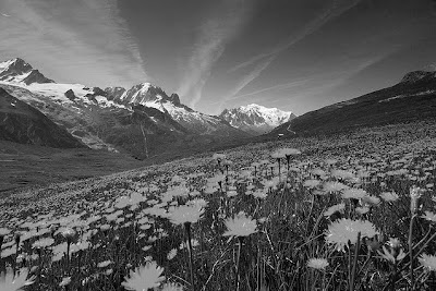
What is it: It’s fair to say the majority of photographs taken are examples of frontlighting. It is what is most familiar - the sun provides the lighting for the photo. Imagine that a giant spotlight was mounted to the top of your digital camera instead of a flash. That’s exactly what frontlighting is.
What is it good for: Just about anything - this is the basic type of light. Frontlighting is the basis behind most forms of landscape photography, since it is capable of creating evenly exposed scenes with striking skies. Camera exposure meters generally thrive in a front-lit environment, making it a great type of light for snapshots or other on-the-go photos.
Challenges: Making the photography interesting. Since almost all photographs are frontlit, it’s tough to make yours look distinctive. In addition, not all frontlighting is valued the same. Midday lighting comes from directly overhead rather than straight-on, producing harsh and distracting shadows. Light in the early morning hours or in the late evening has a richer quality to it, but there’s only a small window to shoot in. You have to be quick.
EXTRA PHOTOGRAPHS (If you choose to do these, these are AFTER the other 36+ photographs)
IF YOU HAVE A CAMERA THAT ALLOWS YOU TO CHANGE THE SHUTTER SPEED, YOU WILL BE ABLE TO PHOTOGRAPH LIGHT TRAILS, OFTEN REFERRED TO AS LIGHT WRITING.
 |
| Joel Meyerowitz. Spinning Christmas Tree. NYC. 1977 |
Spinning lights on a fan. CLICK HERE.
"Light writing" image search. CLICK HERE.
"Writing with light" image search. CLICK HERE.
How to do light writing. CLICK HERE.
This site might help you. CLICK HERE.
*Do a search for "light writing" or "light graffiti" if you need help and/or ideas. There is a lot of information out there.
18 December 2012
13 December 2012
LOOK: Time's Top 10 Photographs of the Year 2012
 |
| Francois Mori. Paris, France. March 20, 2012. |
LOOK: Time Portraits of the Year 2012
 |
| Louis CK, Comedian (Gillian Laub). From "Time 100: The World's 100 Most Influential People" |
12 December 2012
07 December 2012
PROJECT #15: 360º Panorama Landscape (in prep for Project #16)
This example DOES NOT HAVE THE SAME GROUND IN EACH PHOTO.The RED OUTLINE is there to show you WHAT YOU SHOULD PHOTOGRAPH when you take your photographs.


In preparation for stereographic images next week, make THREE full 360 panorama images.
Make sure you turn your camera so you photograph in portrait style.
CAPTURE THE SAME GROUND IN EVERY PHOTO (If you don't do this, our next step will not work for you).
For instance: If this image was your panorama you SHOULD HAVE included the pavement in each photograph you took.
03 December 2012
LOOK: National Geographic Photo Contest 2012
 |
| Photo by Juan Carlos Ruiz Duarte/National Geographic Photo Contest) |
CLICK HERE for Part 1 @ Big Picture.
CLICK HERE for Part 2 @ Big Picture.
P
30 November 2012
PROJECT #13: CLONED-SELF 180º Panoramas
DUE: THREE different panoramas (with you, cloned) brought to class on Monday/Tuesday, December 4 or 5, 2012 (Whichever is your class period) (10 points)
DIRECTIONS: Placing your camera in ONE spot, photograph a full 180º panorama of an intersting/unique/special place of your choosing. As you turn the camera slightly for each separate photograph, place yourself in each photograph. The photos should overlap, so do not turn your camera too much for each photograph. You can do multiple photographs for each turn if you would like, but make sure you are placing yourself in some new place/pose.
When you bring your photos to class, we will stack them and stitch them together in Photoshop to create the full 180º.
Here are two (extreme, and really cool!) examples by Martin Liebscher. CLICK HERE for his site.
Here are some additional examples of non-panorama cloned images. Keep in mind that for our project, your cloned images need to be panoramic.
Click on images for larger view.
26 November 2012
PROJECT #12: SABATTIER SELF-PORTRAITS
25 November 2012
05 November 2012
01 November 2012
PROJECTS #7, #8, #9, #10: Cross Process, Black & White, Sepia, Cyanotype
CROSS PROCESS IN PHOTOSHOP: IMAGE + ADJUSTMENTS + CURVES + CHANNELS (give each channel a slight "S" curve")
 |
| original |
 |
| with cross-process |
SEPIA (BROWNish) IN PHOTOSHOP: IMAGE + ADJUSTMENTS + DESATURATE, then IMAGE + ADJUSTMENTS + PHOTO FILTER + SEPIA (adjust to your preference)
CYANOTYPE (BLUEish) IN PHOTOSHOP: IMAGE + ADJUSTMENTS + DESATURATE, then IMAGE + ADJUSTMENTS + PHOTO FILTER + BLUE/DEEP BLUE (adjust to your preference)
30 October 2012
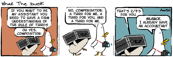
RULE OF THIRDS & Composition
THE FIBONACCI SEQUENCE & THE GOLDEN MEAN
In visual art, Fibonacci numbers are sometimes used to determine the length or size of content or formal elements.
LINKS
A site that contains an explanation of the Golden Mean and its relationship to the rule of thirds HERE
Another site HERE
An explanation of the Fibonacci sequence HERE.
An animation of the Fibonacci sequence HERE.
Another explanation of the Fibonacci sequence HERE.
A site outlining the mystery of the Fibonacci sequence HERE (Really good!)
THE FIBONACCI SEQUENCE & THE GOLDEN MEAN
In visual art, Fibonacci numbers are sometimes used to determine the length or size of content or formal elements.

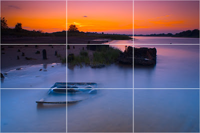
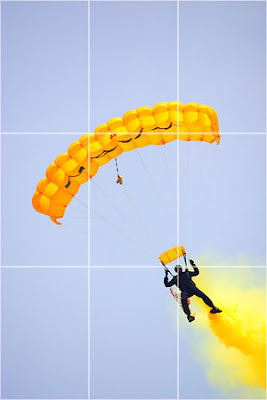
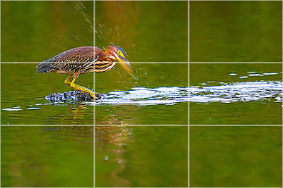
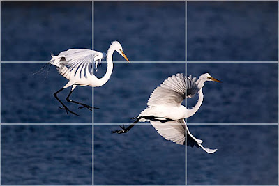
The RULE OF THIRDS is a compositional rule which is recommended for two-dimensional image making. An image could be divided equally by two vertical and two horizontal lines. In general, the four intersections of these lines will be the most interesting places for the main subject(s).
Rule of Thirds from Drew Keller on Vimeo.
The Rule Of Thirds is a method of arranging subject matter within a two-dimensional frame to maximize a harmonious relationship between all planes of subject matter (foreground, middle ground, background). It is used by photographers, painters, film makers, television shows, etc. As one looks through the viewfinder, compositional lines are drawn (mentally) across the picture frame to divide the image into thirds both horizontally and vertically. The photographer places important elements of the composition where these lines intersect.
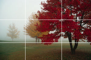
By placing your subject in one of the intersections, one creates a dynamic composition that allows the viewers eye to be drawn to different parts of the compostion in an ordered manner. The viewer is allowed to determine the relationship between 'close-up' subject matter and its relationship to the middle distance and background subject matters.
Click on the following titles to be taken to websites about the Rule Of Thirds:
Rule Of Thirds
The following addresses explain the Rule Of Thirds further:
Rule Of Thirds by Kodak
Rule Of Thirds by Silverlight.co.uk
A Beginner's Guide To Rule Of Thirds
RULE OF THIRDS
Most people will put the seagull right in the middle which is the “dead center”.
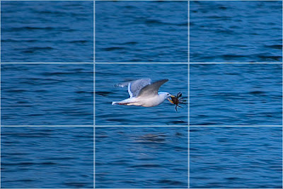
The Rule Of Thirds is a method of arranging subject matter within a two-dimensional frame to maximize a harmonious relationship between all planes of subject matter (foreground, middle ground, background).
Here, the photographer has placed the seagull in the top left intersection. This allows the viewer to "enter" the photograph more easily, and become more engaged with the subject matter.
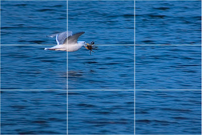
The artist places important elements of the composition where these lines intersect. By placing your subject in one of the intersections, one creates a dynamic composition that allows the viewers eye to be drawn to different parts of the compostion in an ordered manner. The viewer is allowed to determine the relationship between 'close-up' subject matter and its relationship to the middle distance and background subject matter.
Click on the following titles to be taken to websites about the Rule Of Thirds:
Rule Of Thirds
The following addresses explain the Rule Of Thirds further:
Rule Of Thirds by Kodak
Rule Of Thirds by Silverlight.co.uk
A Beginner's Guide To Rule Of Thirds
RULE OF THIRDS
...and some more examples.
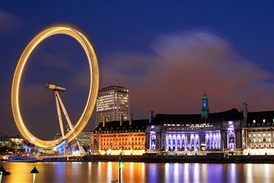
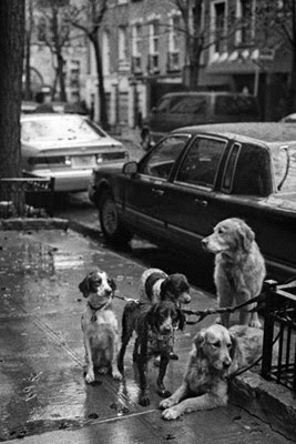
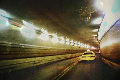
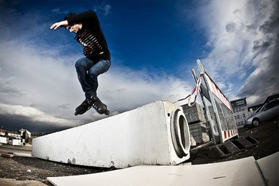
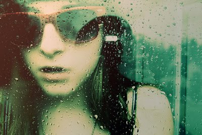
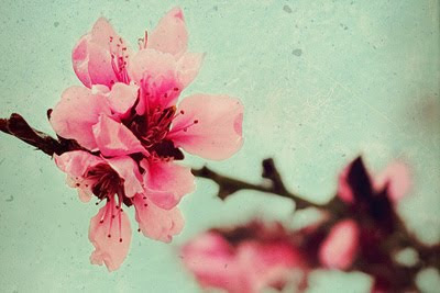
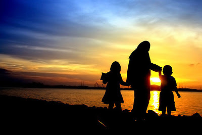
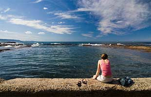
LEADING LINES
Leading lines are lines within an image that leads the eye to another point in the image. As you compose your image within the rule of thirds, try to compose a leading line to take the viewer's eye to your subject matter.

Dorothea Lange photo of the Great Depression.
SOMETHING EXTRA TO CHALLENGE YOU
Try for the following:
1. Have something in your FOREGROUND
2. Have something in your MIDDLE GROUND
3. Have something in your BACKGROUND.
Subscribe to:
Comments (Atom)


