18 December 2018
DEVELOPING TECHNIQUES (10+)
Light leak.
Cross Process.
Texture.
Border.
Sepia.
Cyanotype.
=
TWO each.
Cross Process.
Texture.
Border.
Sepia.
Cyanotype.
=
TWO each.
17 December 2018
12 December 2018
AGENDA FOR THURSDAY, DEC. 13
Good morning, Photogs!
I'm sorry to be out, but whatever germ is going around, I now have it.
Please make the day productive:
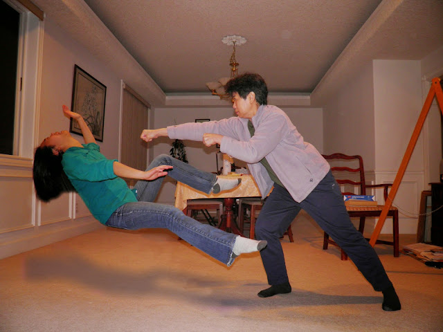
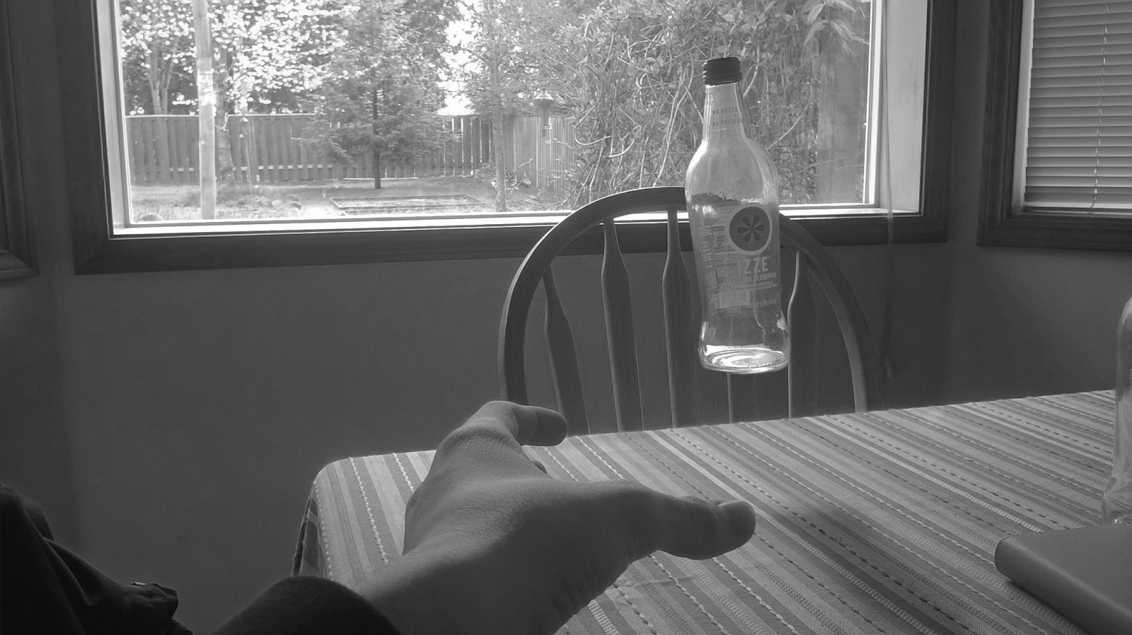
1. Finish Levitation. (Help each other as needed: remember that the shadow may be very subtle.)
2. Post to BLOG and drop to DRIVE.
3. Work on/complete any missing assignments.
4. Post those to BLOG and drop to DRIVE, and then send me an email of whatever those late projects are so that I know to check the drive. (Send to: TuHSPhoto@ttsd.k12.or.us)
5. Use remaining time productively for other class' work.
6. Have a good Wednesday.
Hope to see you next class.
:) Hohman😷
04 December 2018
LEVITATION
DIRECTIONS FOR HOMEWORK:
1. Anchor the camera in ONE spot.
2. Make an EMPTY photograph of your location.
3. DO NOT MOVE THE CAMERA...even a millimeter.
4. Put your partner in place and have them mimic a floating body language (i.e. hands, feet, facial expression...)
5. Make a few photographs of them IN PLACE.
6. Assemble the photographs as instructed.
WHAT WILL BE DUE:
1. THREE unique anti-gravity photographs (two off campus) via the methods below and the tutorial(s) given in class.
2. Bring back AT LEAST TWO groups of photos that can be made into TWO DISTINCTLY DIFFERENT anti-gravity photographs.
THE HOW TO'S:
How to at Colossal. CLICK HERE.
The Art of Levitation. CLICK HERE.
LOOK AT A FEW ARTISTS:
LOUIS LANDER DEACON
More of Natsumi. CLICK HERE.
OTHER EXAMPLES:
65 Examples. CLICK HERE.
Rick Nadal's site. CLICK HERE.
ABrian Speice. CLICK HERE.
Bairon Rivera. CLICK HERE.
Anka Zhuravleva. CLICK HERE.
Moose Photography. CLICK HERE.
And another idea. CLICK HERE.
Floating fruit. CLICK HERE.
More levitation GIFs. CLICK HERE.
1. Anchor the camera in ONE spot.
2. Make an EMPTY photograph of your location.
3. DO NOT MOVE THE CAMERA...even a millimeter.
4. Put your partner in place and have them mimic a floating body language (i.e. hands, feet, facial expression...)
5. Make a few photographs of them IN PLACE.
6. Assemble the photographs as instructed.
WHAT WILL BE DUE:
1. THREE unique anti-gravity photographs (two off campus) via the methods below and the tutorial(s) given in class.
2. Bring back AT LEAST TWO groups of photos that can be made into TWO DISTINCTLY DIFFERENT anti-gravity photographs.


THE HOW TO'S:
How to at Colossal. CLICK HERE.
The Art of Levitation. CLICK HERE.
50 Examples of levitation. CLICK HERE.
7 Tips for better levitation photos. CLICK HERE.
How to do it. CLICK HERE.
7 Tips for better levitation photos. CLICK HERE.
How to do it. CLICK HERE.
LOOK AT A FEW ARTISTS:
LOUIS LANDER DEACON
NATSUMI HAYASHI
Yowayowacamera.com. CLICK HERE.More of Natsumi. CLICK HERE.
65 Examples. CLICK HERE.
Rick Nadal's site. CLICK HERE.
ABrian Speice. CLICK HERE.
Bairon Rivera. CLICK HERE.
Anka Zhuravleva. CLICK HERE.
Moose Photography. CLICK HERE.
And another idea. CLICK HERE.
Floating fruit. CLICK HERE.
More levitation GIFs. CLICK HERE.
20 November 2018
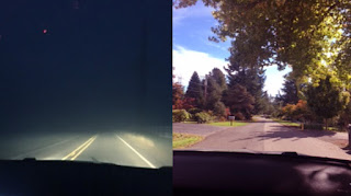
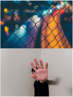
DAYDREAM/NIGHTMARE DIPTYCH
Explain the symbolism of each photo in the diptych.
At least one full sentence for each photograph that explains objects,
place, time of day, color, facial expression
...the meaning of the photo through what is IN the photo.
At least one full sentence for each photograph that explains objects,
place, time of day, color, facial expression
...the meaning of the photo through what is IN the photo.
16 November 2018
PROJECT #12: WEEKEND THEME - "My Daydream/My Nightmare"
RATIONALE:
To make images that are visual representations of what the two words - daydream & nightmare - mean to you, and to practice creative problem solving by thinking metaphorically and representationally.
DIRECTIONS:
This weekend themed project is about visual metaphor.
Visual metaphor is the representation of an idea through place/person/object/time/composition/color/etc.
First: Think of nightmare. What does that mean to you? What is the first picture that comes to mind? THAT could be your starting point.
Next: With what you have access to in your personal life, how can you photograph THAT idea in way that will produce a well lit, purposefully composed, and good image?
1. Make 3+ photographs that represent your definition of what a "daydream" looks like.
2. Make 3+ photographs that represent your definition of what a "nightmare" looks like.
2. Think outside the box to a sunny pleasant place...and inside to a dark corner of the box.
3. You will be putting together TWO diptychs next class, so will need at least THREE+ photographs of each idea.
4. Test your creativity in new and challenging ways.
NOTE: You must be in one of the photos in each diptych. No, do not make one of those ubiquitous selfies where you're trying to look good (booo!), but rather put yourself in the photo in some other way (yay!)
INSPIRATION:
Arthur Tress. CLICK HERE.
People lost in daydreams. CLICK HERE.


14 November 2018
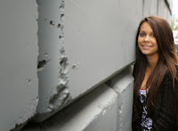
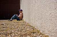
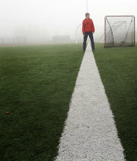
PROJECT #11: LEADING LINES
DIRECTIONS in CLASS (4 points):
1. Make the photos as directed on the handout example sheet.
2. Develop and post the photos to a post titled "LEADING LINES"
DIRECTIONS for HOMEWORK (4 points):
1. Make EIGHT (8+) more photos OUTSIDE OF SCHOOL that have one or two OBVIOUS leading lines that draw our eye to your subject matter. Due next class.
Photo by Steve McCurry
1. Make the photos as directed on the handout example sheet.
2. Develop and post the photos to a post titled "LEADING LINES"
DIRECTIONS for HOMEWORK (4 points):
1. Make EIGHT (8+) more photos OUTSIDE OF SCHOOL that have one or two OBVIOUS leading lines that draw our eye to your subject matter. Due next class.
****************************************************************************
Photo by Steve McCurry
|
|
| Henri Cartier Bresson. Hyères, France. 1932 |
The lines that compose the Bresson photo:
 |
| (About the Hyères photo. CLICK HERE.) Cartier-Bresson's site. CLICK HERE. |
ANSEL ADAMS' ICONIC SNAKE RIVER PHOTOGRAPH:
 |
| Ansel Adams, The Tetons and the Snake River, Grand Teton National Park, WY, 1942, photo, NARA, Records of the National Park Service, Washington, D.C. |
“A great photograph is one that fully expresses what one feels, in the deepest sense, about what is being photographed, and is thereby a true manifestation of what one feels about life in its entirety.” Quote of Ansel Adams (1902-1984)*
AND MY PERSONAL ALL-TIME FAVORITE LEADING LINES IMAGE:
 |
| Grandmother. Brooklyn, NY. 1993. Eugene Richards. |
BASIC EXAMPLES OF LEADING LINE:


07 November 2018
31 October 2018
IN-CLASS TUTORIAL: SWAP/PIXELATED/THATCHER
*See me if you were absent for this.
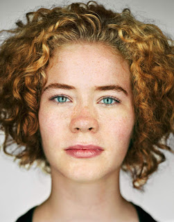
PIXELATED ME
More about the Thatcher Effect. CLICK HERE.



PIXELATED ME
THATCHER EFFECT
Thatcher Effect explained. CLICK HERE.More about the Thatcher Effect. CLICK HERE.


23 October 2018
PROJECT #8: DIRECT SIDE LIGHT
DIRECT SIDE LIGHT:
DIRECTIONS:
1. Place your person in a such a way that ONE light source creates a distinct shadow on one side of their face.
2. Have your person move their head/body in such a way that there are different shadows for each photograph.
3. Make EIGHT+ photographs with this method.
NOTE:
*An obvious and distinctly dark shadow should be visible.
**An obvious direction from where the light is emanating (FROM ONLY ONE SIDE!) should be 'arranged.'
18 October 2018
RULE OF THIRDS
FIRST...THE FIBONACCI SEQUENCE & THE GOLDEN MEAN
In visual art, Fibonacci numbers are sometimes used to determine the length or size of content or formal elements.
LINKS
A site that contains an explanation of the Golden Mean and its relationship to the rule of thirds HERE
Another site HERE
An explanation of the Fibonacci sequence HERE.
An animation of the Fibonacci sequence HERE.
Another explanation of the Fibonacci sequence HERE.
A site outlining the mystery of the Fibonacci sequence HERE (Really good!)
NOW, RULE OF THIRDS.
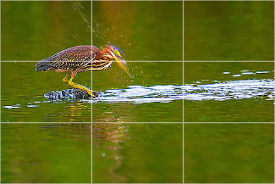
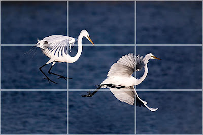
The RULE OF THIRDS is a compositional rule which is recommended for two-dimensional image making. An image could be divided equally by two vertical and two horizontal lines. In general, the four intersections of these lines will be the most interesting places for the main subject(s).
The Rule Of Thirds is a method of arranging subject matter within a two-dimensional frame to maximize a harmonious relationship between all planes of subject matter (foreground, middle ground, background). It is used by photographers, painters, film makers, television shows, etc. As one looks through the viewfinder, compositional lines are drawn (mentally) across the picture frame to divide the image into thirds both horizontally and vertically. The photographer places important elements of the composition where these lines intersect.
By placing your subject in one of the intersections, one creates a dynamic composition that allows the viewers eye to be drawn to different parts of the compostion in an ordered manner. The viewer is allowed to determine the relationship between 'close-up' subject matter and its relationship to the middle distance and background subject matters.
Click on the following titles to be taken to websites about the Rule Of Thirds:
Rule Of Thirds
The following addresses explain the Rule Of Thirds further:
Rule Of Thirds by Kodak
Rule Of Thirds by Silverlight.co.uk
A Beginner's Guide To Rule Of Thirds
Most people will put the seagull right in the middle which is the “dead center”.
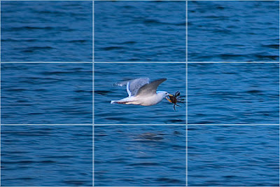
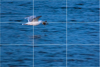
The artist places important elements of the composition where these lines intersect. By placing the subject in one of the intersections, one creates a dynamic composition that allows the viewers eye to be drawn to different parts of the compostion in an ordered manner. The viewer is allowed to determine the relationship between 'close-up' subject matter and its relationship to the middle distance and background subject matter.
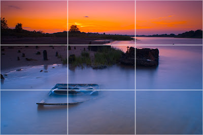
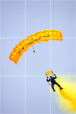
RULE OF THIRDS
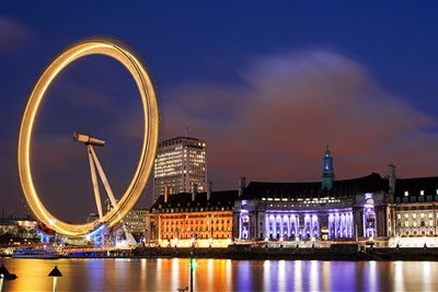
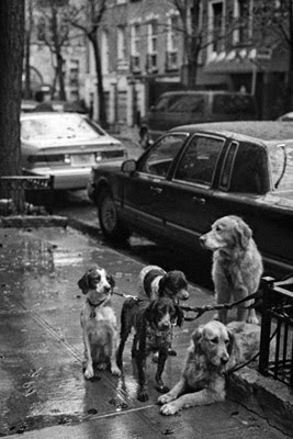
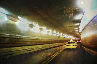
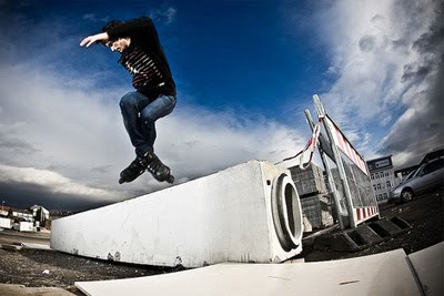
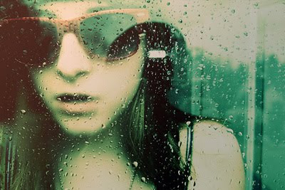
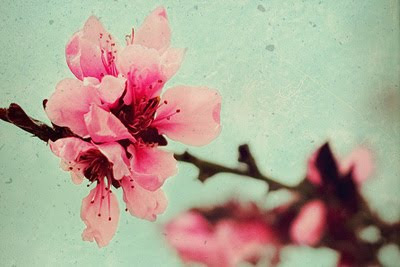
...and some more examples.



In visual art, Fibonacci numbers are sometimes used to determine the length or size of content or formal elements.
LINKS
A site that contains an explanation of the Golden Mean and its relationship to the rule of thirds HERE
Another site HERE
An explanation of the Fibonacci sequence HERE.
An animation of the Fibonacci sequence HERE.
Another explanation of the Fibonacci sequence HERE.
A site outlining the mystery of the Fibonacci sequence HERE (Really good!)
NOW, RULE OF THIRDS.
The RULE OF THIRDS is a compositional rule which is recommended for two-dimensional image making. An image could be divided equally by two vertical and two horizontal lines. In general, the four intersections of these lines will be the most interesting places for the main subject(s).
The Rule Of Thirds is a method of arranging subject matter within a two-dimensional frame to maximize a harmonious relationship between all planes of subject matter (foreground, middle ground, background). It is used by photographers, painters, film makers, television shows, etc. As one looks through the viewfinder, compositional lines are drawn (mentally) across the picture frame to divide the image into thirds both horizontally and vertically. The photographer places important elements of the composition where these lines intersect.
By placing your subject in one of the intersections, one creates a dynamic composition that allows the viewers eye to be drawn to different parts of the compostion in an ordered manner. The viewer is allowed to determine the relationship between 'close-up' subject matter and its relationship to the middle distance and background subject matters.
Click on the following titles to be taken to websites about the Rule Of Thirds:
Rule Of Thirds
The following addresses explain the Rule Of Thirds further:
Rule Of Thirds by Kodak
Rule Of Thirds by Silverlight.co.uk
A Beginner's Guide To Rule Of Thirds
Most people will put the seagull right in the middle which is the “dead center”.


The artist places important elements of the composition where these lines intersect. By placing the subject in one of the intersections, one creates a dynamic composition that allows the viewers eye to be drawn to different parts of the compostion in an ordered manner. The viewer is allowed to determine the relationship between 'close-up' subject matter and its relationship to the middle distance and background subject matter.


RULE OF THIRDS
...and some more examples.


15 October 2018
04 October 2018
METAPHOR #2
met·a·phor
ˈmedəˌfôr,ˈmedəˌfər/
noun
a thing regarded as representative or symbolic of something else,
especially something abstract.
***********************************************
especially something abstract.
***********************************************
EXPLANATION. For the 2nd weekend metaphor assignment, you will make a photograph for the three words below. Each photograph should be a visual metaphor that represents and is symbolic of that word/term.
THE THREE WORDS/TERMS:
sharp
soft
chill
soft
chill
STUDENT EXAMPLE OF A VISUAL METAPHOR:
The apple above is a photo a student made for the word "forbidden." The photo tells a story in relation to the word? Good, huh? ;) Use this as an example to inspire your creative thinking. Go beyond the obvious. Push your brain to make unusual/unexpected connections to images.
03 October 2018
Subscribe to:
Comments (Atom)


